Subfigures in HTML/CSS
Published 24/08/2025
Contents
1 Introduction
When writing academic content, it is sometimes desirable to display
related figures side by side. In LaTeX, the subfigure
environment provides a convenient solution for this. When writing the
code that is used to create this website, I wanted to develop a similar
capability for the web. The layouting of subfigures on the web also
needs to be responsive, so that figures are viewable on screens of
different sizes. As it turns out, this complicates things somewhat. This
article demonstrates how to achieve responsive subfigure layout on the
web.
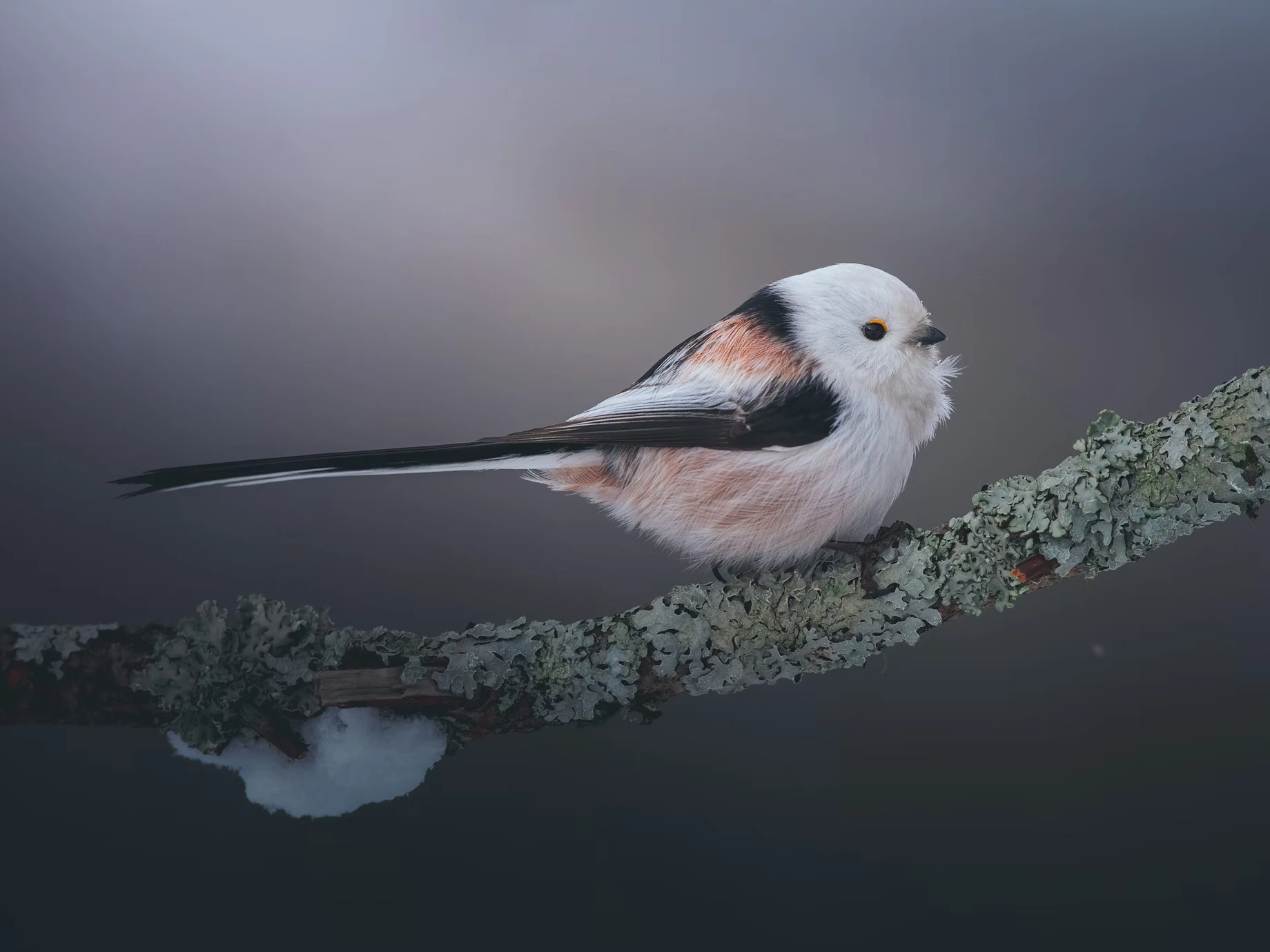
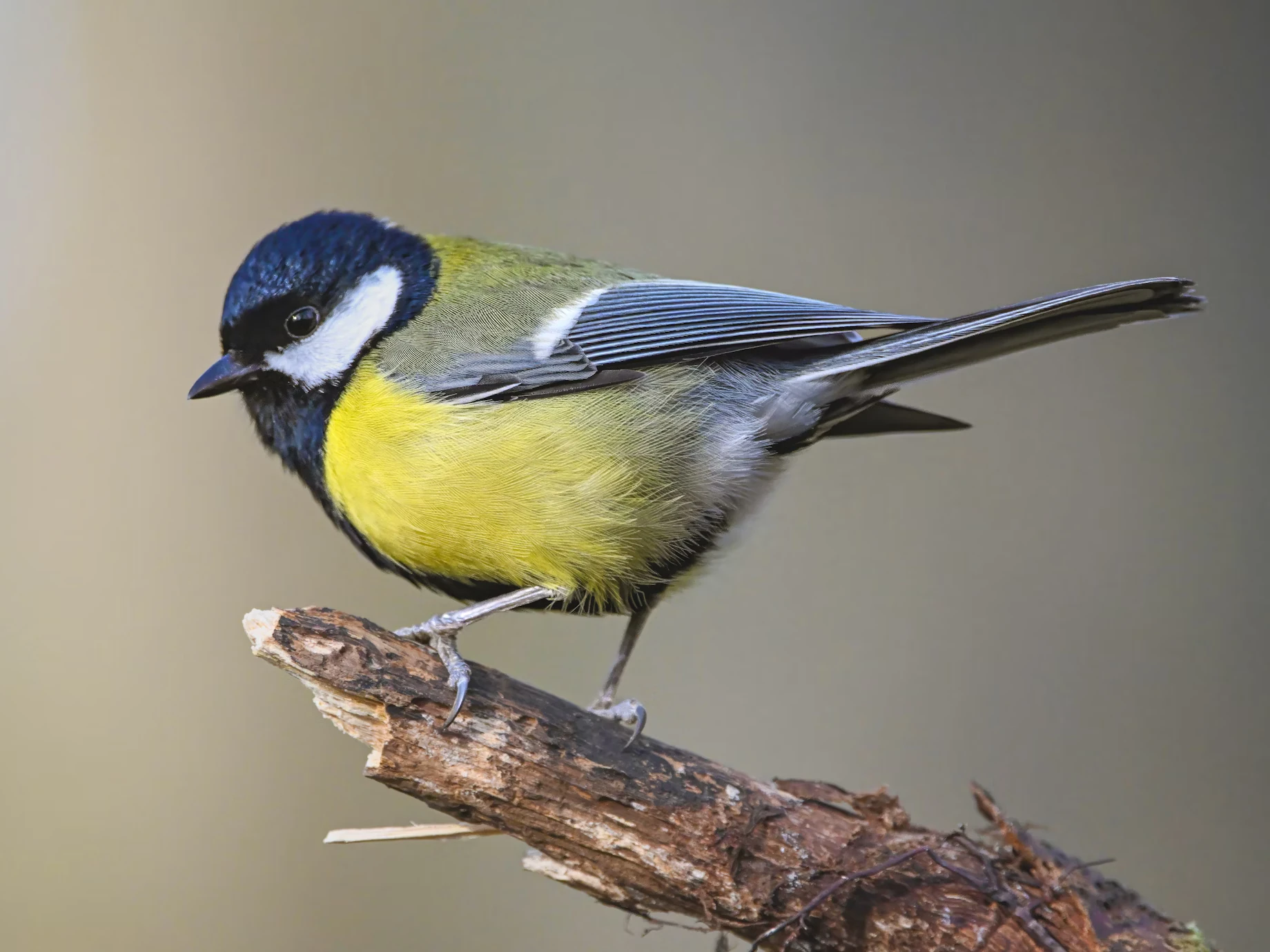
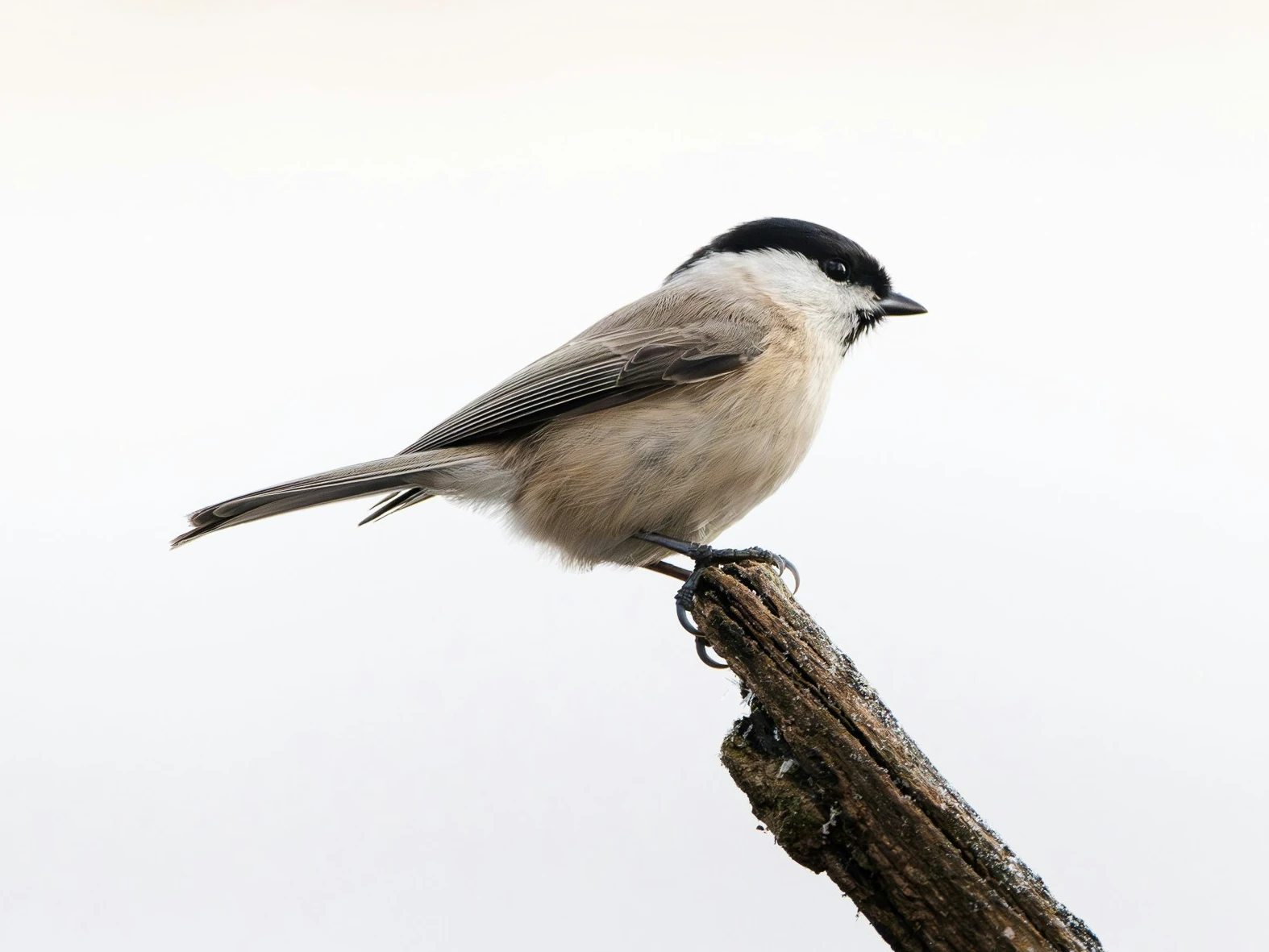
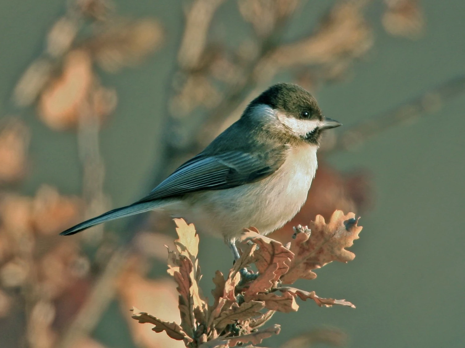
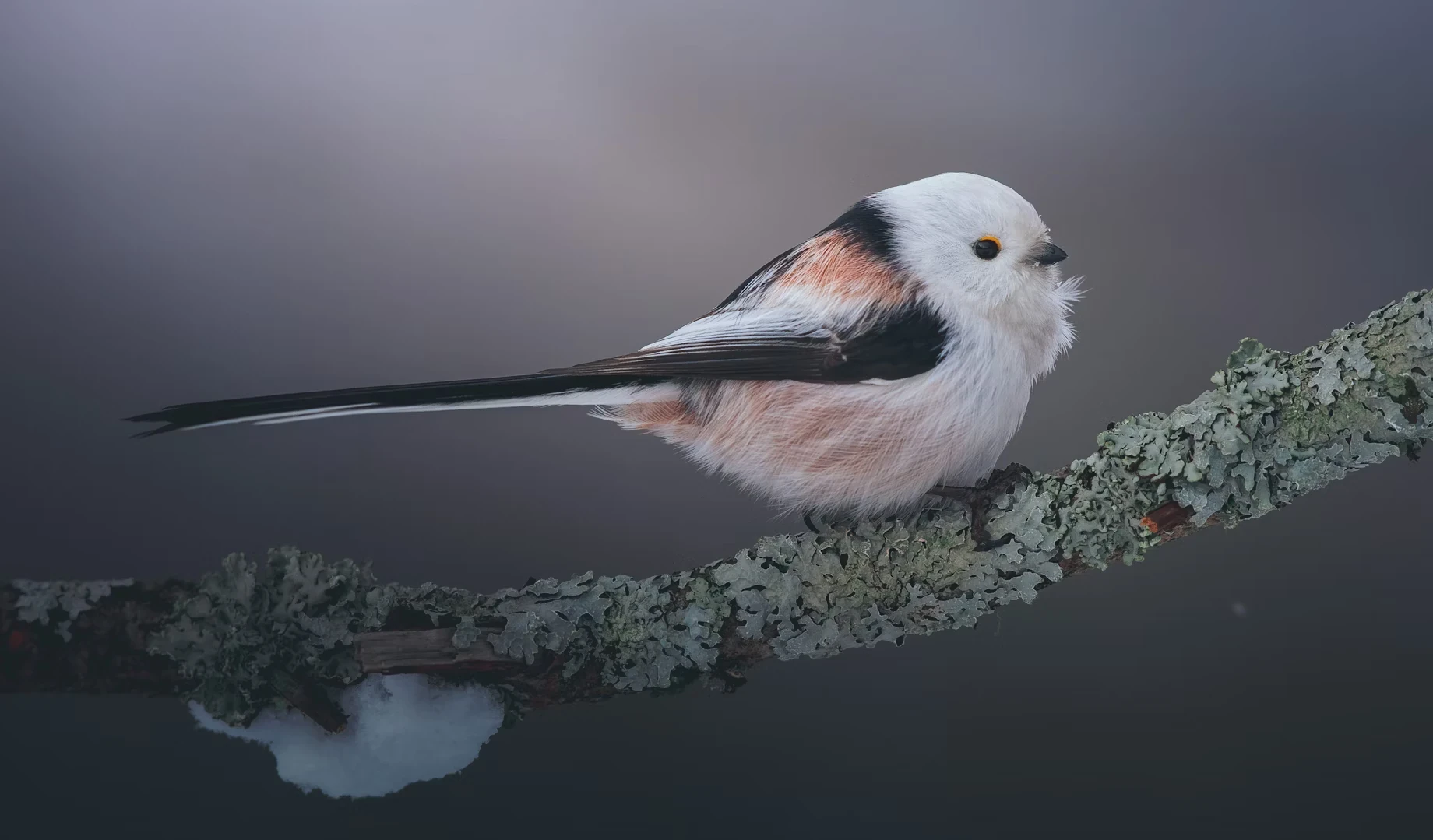
To give you an idea of what we want to achieve, have a look at Fig. 1. Note that the number of subfigures per row depends on the size of the screen on which you are viewing this article.[1][1]: On a sufficiently wide screen, there are three subfigures per row, except for the last row, which contains two subfigures.

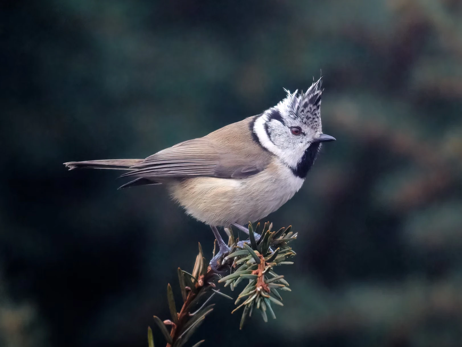
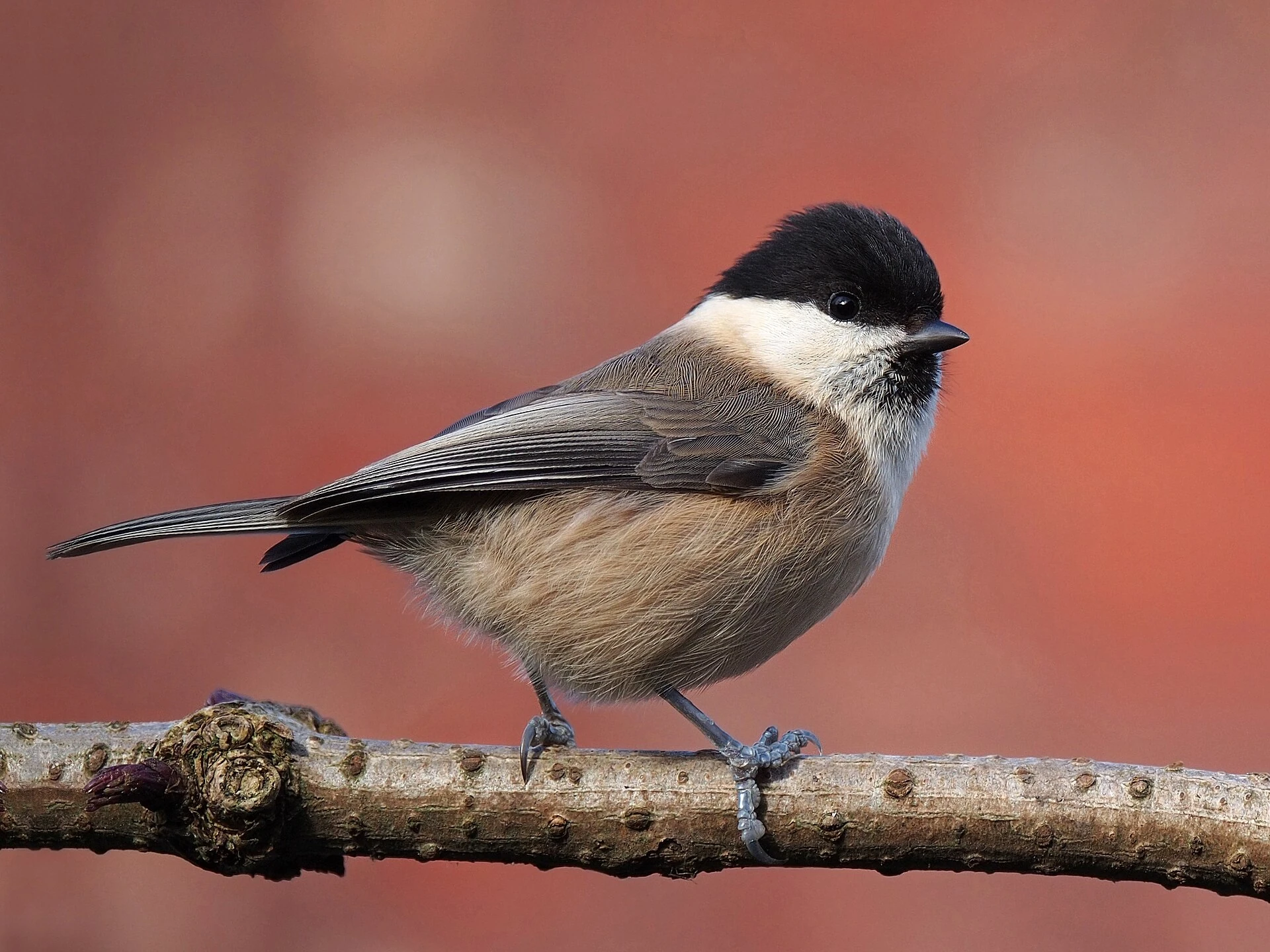
[2]: Credit Regine Tholen.
[3]: Credit Simerpreet Cheema.
[4]: Credit Daniil Komov.
[5]: Credit Siegfried Poepperl.
[6]: Credit Elias Maurer.
[7]: Credit Francis C. Franklin / CC-BY-SA-3.0.
[8]: Credit doncoombez.
[9]: Credit Steve Riall.
2 Subfigures in HTML
Before we dive into the CSS, let’s briefly look at what subfigures
look like in HTML. Subfigures are simply <figure>
elements that are contained in other <figure>
elements:
<figure>
  <figure>
    <img src="first.jpg" alt="..." />
    <figcaption>First subfigure.</figcaption>
  </figure>

  <figure>
    <img src="second.jpg" alt="..." />
    <figcaption>Second subfigure.</figcaption>
  </figure>

  <figure>
    <img src="third.jpg" alt="..." />
    <figcaption>Third subfigure.</figcaption>
  </figure>

  <figcaption>Three subfigures.</figcaption>
</figure>
3 CSS layout
Two possible CSS layout options spring to mind: flex
and grid.
With a Flexbox layout, we would need to set flex-wrap: wrap
to allow subfigures to be displayed in multiple rows. CSS Grid is
designed to layout items in a grid, as the name suggests. When we have
subfigures on multiple rows, and the subfigures on the last row cannot
fill the row, then we want these subfigures to be centred. Where the
difference between the number of subfigures on all but the last row and
the number of subfigures on the last row is an odd number, the
subfigures on the last row won’t line up with the grid columns
established by the subfigures on all but the last row.[10][10]: Or, equivalently, (1)where is the number of subfigures and the number of columns on all but the last
row. An example of this is a 3/3/2 layout (where the subsequent
numbers represent the number of subfigures on subsequent rows), as in Fig. 1, if you are viewing this
article on a sufficiently large screen. Therefore, a CSS Grid layout
wouldn’t be suitable in this case, and we are stuck with Flexbox.
To ensure items on the last line are centered, we need to set
justify-content: center. Furthermore, in case of subfigures
of different heights, we would like to align the respective first
baselines of their captions, as this is least aesthetically displeasing.
This can be done using align-items: baseline. One might
wonder whether this will work, given that the subfigure captions are
children of the subfigures, and the subfigures themselves don’t have
baselines as such. However, it seems that browsers consider the first
child’s baseline in this case, so everything works as desired. Lastly,
we would like to set a consistent column-gap. We will do
this using a CSS
custom property for reasons that will become apparent later. To sum
up:
figure:has(> figure) {
  --column-gap: 1em;

  display: flex;
  flex-wrap: wrap;
  justify-content: center;
  align-items: baseline;
  column-gap: var(--column-gap);
}
However, without setting the subfigures’ width, they will all be
bunched up on one row, as there is nothing to force them onto another
row. To allow subfigures to occupy all the available width, we are going
to set a min-width on them. That way, a subfigure wraps
onto another row when the available space becomes insufficient, and the
subfigures which remain on the previous row can expand and take up the
width that was freed up by the now wrapped subfigure.
Ideally, we would like to specify the subfigures’
min-width only once, and not for each subfigure
individually. We can do this by setting a --min-width CSS
custom property on the containing <figure> element:[11][11]: For this website, I use a
pandoc filter to
create the subfigures and apply the specified min-width as
a CSS custom property.
<figure style="--min-width: 15em">
  <figure>...</figure>
  ...
</figure>
The minimum width of the subfigure is then set as follows (ensuring that the subfigure never takes up more than 100% of the article width):
figure > figure {
  min-width: min(var(--min-width), 100%);
  flex-basis: 0;
  flex-grow: 1;
}
The flex-basis declaration ensures that as many
subfigures as possible are placed in the same row, in case images are
sized to the full article width by default elsewhere in the stylesheet.
The flex-grow declaration guarantees that subfigures grow
until they have taken up all the available space in a row.
We are almost there. Applying these styles to Fig. 1, we have:
Setting a min-width rather than a width on
the subfigures causes the subfigures in the last row to expand to a
greater width than the preceding subfigures, which isn’t desirable (if
you are reading this article on a mobile device, you can see this effect
by tilting into landscape mode, or alternatively, by ticking the
“Desktop site” checkbox). We therefore need to calculate the required
width and set it on the subfigures. To avoid potential issues with
subfigures wrapping prematurely due to floating point errors, we are
actually going to set the subfigures’ max-widths.
The subfigure’s width is equal to its minimum width plus the additional space , equally distributed amongst the subfigures on a given row: (2)where is the number of columns in all but the last row. The additional space is equal to the remainder of article width plus one column gap width , divided by the sum of subfigure minimum width and column gap width: (3) Finally, we need to find an expression for the number of columns . This is simply the quotient of the sum of article width and column gap width, and the sum of minimum article width and column gap width, rounded down to the closest integer: (4)Putting everything together, we obtain (5)
To implement Eqn. 5, we
prefer a pure CSS solution using calc(),
as this is going to be faster than JavaScript, and will furthermore
minimise any layout
shift when the page is loading.
The astute reader may have spotted that Eqn. 5 contains a division involving a dimensional
denominator (the argument to the floor function), and a divisor used in
calc() must be a <number> and cannot be
a <dimension>. WebKit of all browser engines recently
added support for unit division in CSS[12][12]: See also the corresponding
release., and one can only hope that Gecko and Blink will
soon follow suit. For the time being, we can use Jane
Ori’s tan(atan2(numerator, denominator)) workaround,
which works because the result of the CSS
tan function is unitless.
The floor function can be implemented using the CSS
round function, which takes as second argument a
rounding interval. This interval is equal to the sum of the minimum
subfigure width and the column gap width.
Putting everything together, we have the following rather involved declaration:
figure > figure {
  min-width: min(var(--min-width), 100%);
  max-width: calc(var(--min-width) +
                  mod(100% + var(--column-gap), (var(--min-width) + var(--column-gap))) /
                  tan(atan2(round(down,
                                  calc(100% + var(--column-gap)),
                                  calc(var(--min-width) + var(--column-gap))),
                            var(--min-width) + var(--column-gap))));
  flex-basis: 0;
  flex-grow: 1;
}
This works great on Blink or WebKit based browsers (Chromium and
Safari), but unfortunately not on Gecko (Firefox). This is because Gecko
currently doesn’t
support dissimilar units in the atan() function. Until
this bug is fixed, we can use a JavaScript-based workaround. The
following script does the job:
/**
 * Detect Firefox to work around Gecko bugs.
 * @return {boolean} - Whether browser is Gecko-based or not
 */
function isGecko() {
  return /(?<!like )Gecko/.test(navigator.userAgent);
}


/**
 * See https://bugzilla.mozilla.org/show_bug.cgi?id=1802744. Gecko doesn't
 * support mixing units in the `atan2()` CSS function. Instead, the max-widths
 * of the subfigures in the last row need to be applied using JS.
 */
function avoidGeckoBug1802744() {
  const subfigContainers = document.querySelectorAll('figure:has(> figure)');
  for (const container of subfigContainers) {
    const applyMaxWidths = () => {
      const subfigs = [...container.querySelectorAll(':scope > figure')];
      const first = subfigs[0], last = subfigs.at(-1);
      const getBaseline = (subfig) => {
        const img = subfig.querySelector(':scope img');
        return img && img.offsetTop + img.offsetHeight;
      };
      const lastRowBaseline = getBaseline(last);
      const multipleRows = lastRowBaseline > getBaseline(first);
      if (multipleRows) {
        console.debug('Avoiding Gecko bug 1802744.');
        const subfigsInLastRow =
            subfigs.filter((subfig) => getBaseline(subfig) == lastRowBaseline);
        const maxWidth = first.getBoundingClientRect().width;
        // Set max-widths.
        for (const subfig of subfigsInLastRow) {
          subfig.style.maxWidth = maxWidth + 'px';
        }
        // Remove max-widths on remaining elements, if this function has been run previously.
        for (const subfig of subfigs.slice(1, subfigs.length - subfigsInLastRow.length)) {
          subfig.style.maxWidth = '';
        }
      }
    };
    applyMaxWidths();
    let oldContainerWidth = container.getBoundingClientRect().width;
    (new ResizeObserver(() => {
      const newContainerWidth = container.getBoundingClientRect().width;
      if (newContainerWidth != oldContainerWidth) {
        oldContainerWidth = newContainerWidth;
        applyMaxWidths();
      }
    })).observe(container);
  }
}

if (isGecko()) {
  avoidGeckoBug1802744();
}
4 Appendix: Subfigures of different aspect ratios
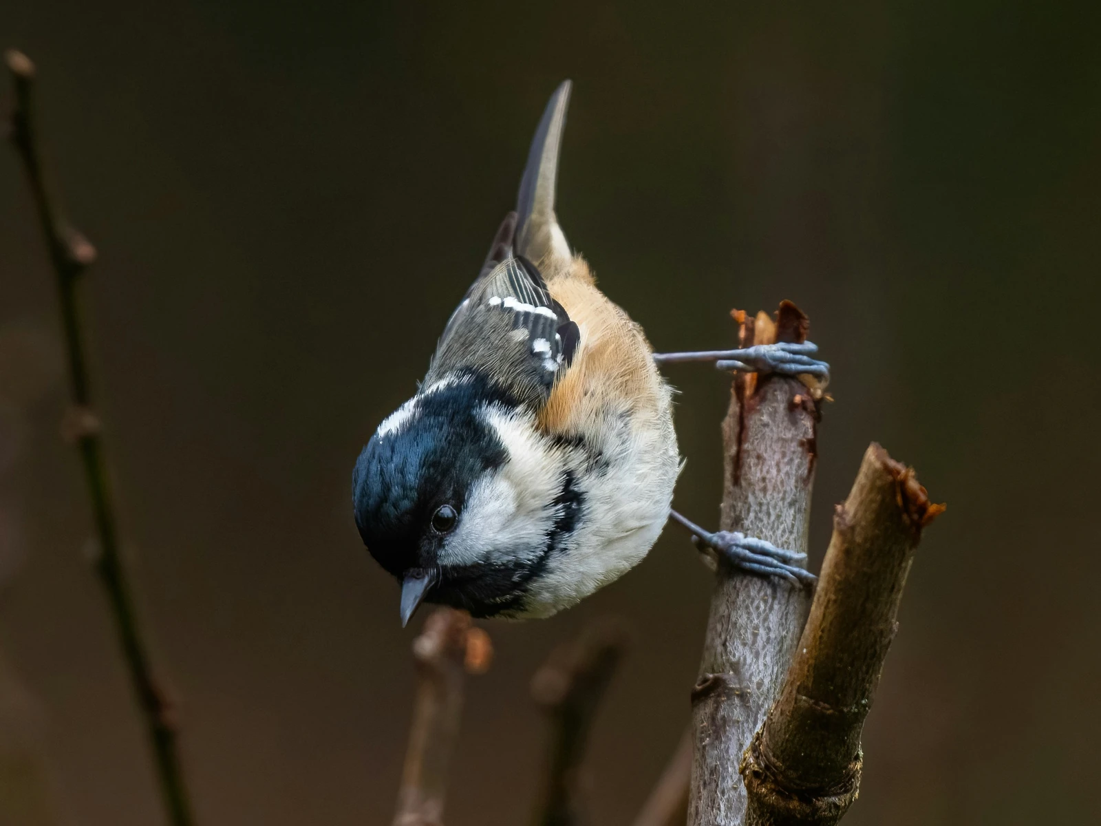
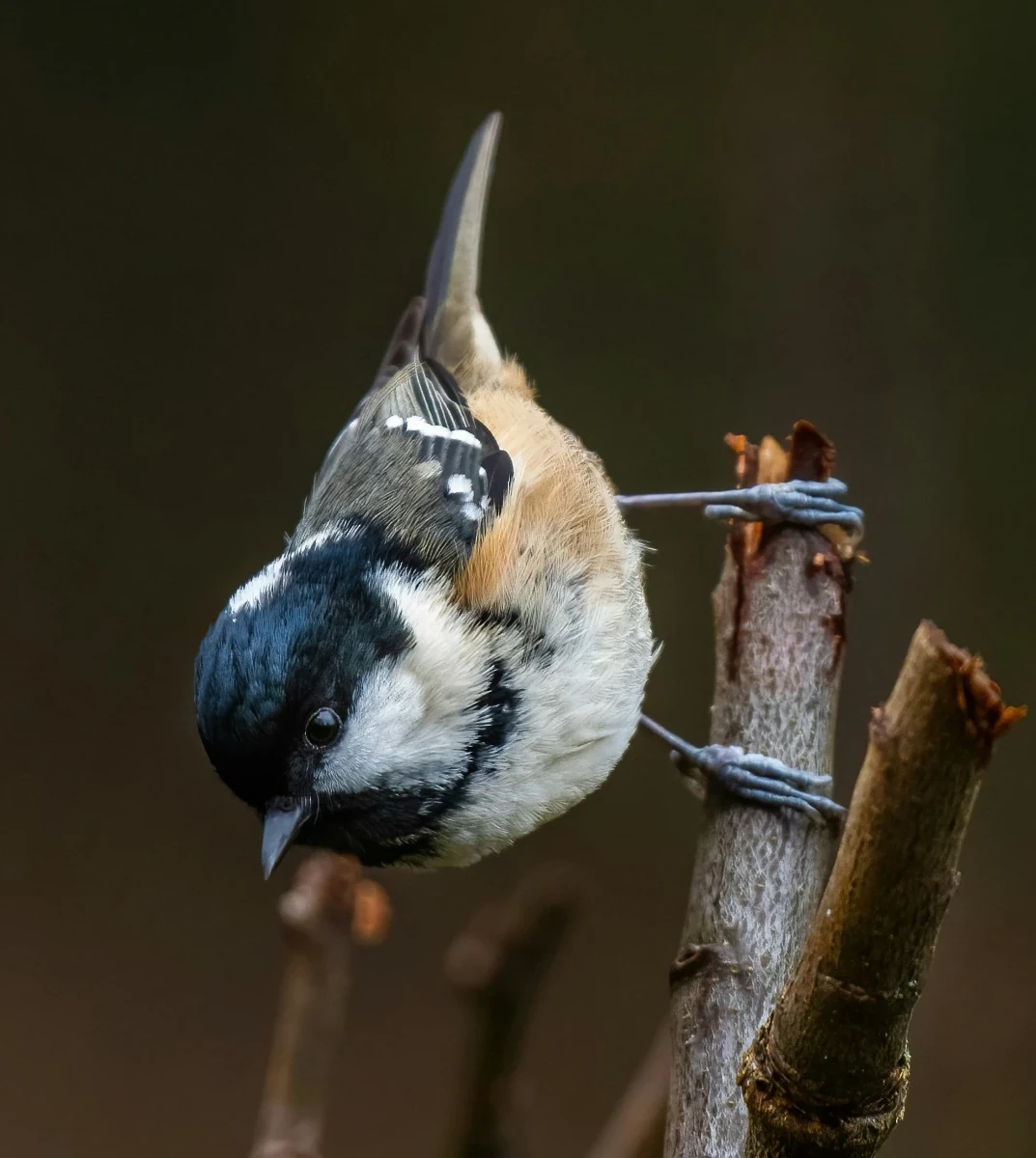
Particularly when there are only a few subfigures, and the images’ aspect ratios are different, it can be pleasing to produce a layout where all subfigures in a given row have the same height. Fig. 2 shows this approach, and Fig. 3 contrasts this with our usual subfigure layout.
To create this layout, we can utilise the flex-basis
and flex-grow
properties. The flex-basis property sets the initial size
of the flex item, before any additional space is allocated. The
flex-grow property decides how much of the free space is
allocated to the respective flex item. By setting
flex-basis: 0 and flex-grow equal to the
image’s aspect ratio, we can ensure that all subfigure images in a row
have the same height. Furthermore, we can specify a minimum height (in
the same manner as we specified a minimum width for our regular
subfigures) to which subfigure images may shrink before they wrap onto a
new row. We’ll apply these rules to figure containers of class
equal-heights:
figure.equal-heights > figure {
  flex-basis: 0  /* We've already set `flex-basis` previously, so this is redundant. */
  flex-grow: calc(var(--aspect-ratio));
  min-width: min(calc(var(--min-height) * var(--aspect-ratio)), 100%);
}
Since the subfigure’s height is the sum of the image’s and caption’s
heights (neglecting margins), we need to convert the minimum height into
a min-width by multiplying it by the image’s aspect ratio.
The --min-height custom property needs to be set on the
containing <figure> element, in the same way the
--min-width custom property was made available in our
regular subfigure layout.
The --aspect-ratio custom property needs to be set
separately on each subfigure. How this can be done depends on your
content management system.[13][13]: For this website, I use a pandoc filter which determines the
aspect ratios of images using the pandoc.image.size
function and subsequently sets
--aspect-ratio: <width> / <height> on each
subfigure.